
Last week the USDA updated their old, out of date food pyramid with a new plate. I don’t remember what the old pyramid looked like to be honest except for that it had pictures of bread and pasta at the bottom and chocolate and candy and everything good in the world at the top. I wasn’t a fan of the old one, so I was happy they changed the look. I wasn’t sure what I thought about it at first, but then I saw this:
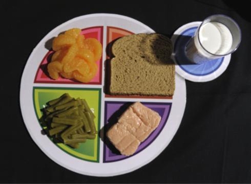
That’s just sad.
I’m not saying I don’t have meals at times that look disgusting, like a child just threw things together in his plate and started playing with his food. And I’m definitely not saying I haven’t eaten meals standing up in front of an open refrigerator door. But there’s no way that that’s MyPlate.
Let’s pick apart what’s wrong with that image from a foodie and a food blogger’s perspective, shall we?
- The light is only coming from one angle which creates unwanted dramatic shadows.
- Food always looks better on white, neutral plates, or at least plates that aren’t segmented and multicolor.
- Fresh food photographs better.
- I’m not even sure what that pink thing is; it could be a giant Band-Aid for all I can tell.
- I don’t think that dairy or grains are absolutely essential to any diets. While most people can digest them perfectly fine, there’s no reason they need to be there as opposed to other food groups such as beans and nuts.
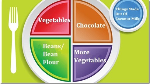
So, since one plate clearly doesn’t fit all, I made my own that’s more accurately suited for me:
At first I made this as a joke.
And then I realized I’m actually just a parody of myself for eating things like this,
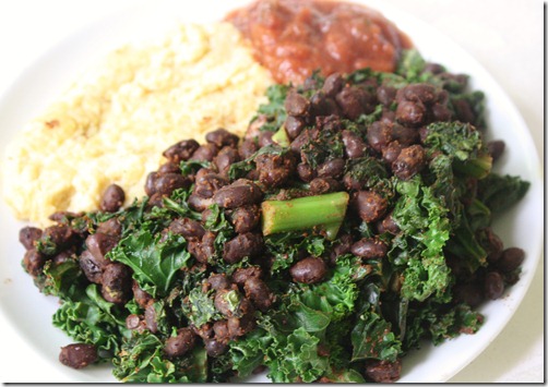
and this,
and definitely this
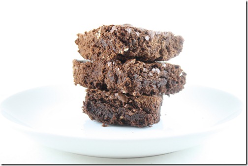
all. the. time.
But that’s OK, because those are my plates and they work for me.
What are your thoughts on the new plate system? What would your plate look like?






To be blunt, I think the new plate is stupid. They don’t take into account those of us who cannot eat tons of vegetables due to digestive diseases (ahem, Crohn’s) and other conditions in which food can affect the person’s well-being.
I don’t like the new plate either. I think the example picture they have emphasizes the wrong idea: that attempting to eat a balanced, healthy diet is not appetizing, nor fun. In fact, I’m not sure how healthy that picture is, and I sure as hell would never feed anyone that plate of food (good point on the pink thing looking like a withered band-aid). I also have several friends who take issue with the emphasis on dairy. While I love yogurt, milk based products are not the only foods that provide you with calcium. But the general population probably wouldn’t know that (thank you dairy council). And what about people with food allergies?
Anyway, I’m not sure what my plate would look like. Chocolate would definitely be on there! 😀
I am appalled by the new “MyPlate”. I understand that they want to keep it simple and have more of a visual for people, but it is too bare bones. It doesn’t explain anything!
Although, I like your version of the plate. 😉
I hate the example picture of the plate, why did they have to choose the most unappetizing looking food? There are a million ways to make that look better, and I agree with the fact that grains and dairy are not “staple” diet needs. I personally eat both, but there could definitely be better ways to show it.
the new plate is an improvement for sure but that wouldn’t take much would it! i would have a cup of coconut milk on my plate, 1/2 meat and 1/2 veggies with some berries thrown in there. the paleo plate 😉 i don’t think we need grains at all…they are cheap but i don’t feel they offer any nutritional value that meat, veg & fruit cannot offer collectively!
Seriously, you just cracked me up! Possibly because your plate looks like what my plate would look like! Thanks for the big grin!
You should check out Potomac Chocolate’s blog. They added chocolate to MyPlate as well.
I think it’s a step in the right direction – more emphasis on veggies and less on grains than before. Veggies are delish anyway.
my plate would be about 75% veggies! ah! full of greenery i am afraid!
I love your plate. It looks much more appetizing than the one that the USDA put out.
I dont think they could make the new plates any uglier artistically speaking if they tried!
As far as what to eat, how to eat, and recommendations…such a big topic. To each his or her own!
In comparison with the pyramid it’s a step up… a baby step but a step. I think it’s nice for families who don’t know how to step out of McD’s and make a meal to eat in balance.
However for those of us with issues (like veggiegirl said) this won’t work. I can’t eat the bread, drink the cup o’ milk and can’t eat meat.
So I say snap up http://www.evansplate.com now and market it. I love the chocolate section 🙂
My plate would probably have half tofu and the other half broccoli…drenched in some sort of nut buttery sauce:)
Meh. They’re always changing something about it. Really, everything changes – the best we can do is just do what we feel is best at the time.
Nice new layout by the way!