Last week the USDA updated their old, out of date food pyramid with a new plate. I don’t remember what the old pyramid looked like to be honest except for that it had pictures of bread and pasta at the bottom and chocolate and candy and everything good in the world at the top. I wasn’t a fan of the old one, so I was happy they changed the look. I wasn’t sure what I thought about it at first, but then I saw this:
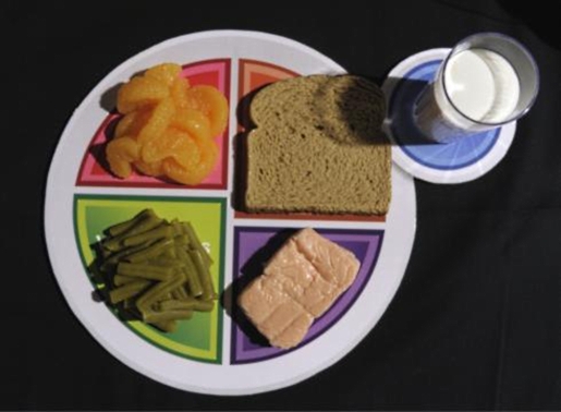
That’s just sad.
I’m not saying I don’t have meals at times that look disgusting, like a child just threw things together in his plate and started playing with his food. And I’m definitely not saying I haven’t eaten meals standing up in front of an open refrigerator door. But there’s no way that that’s MyPlate.
Let’s pick apart what’s wrong with that image from a foodie and a food blogger’s perspective, shall we?
- The light is only coming from one angle which creates unwanted dramatic shadows.
- Food always looks better on white, neutral plates, or at least plates that aren’t segmented and multicolor.
- Fresh food photographs better.
- I’m not even sure what that pink thing is; it could be a giant Band-Aid for all I can tell.
- I don’t think that dairy or grains are absolutely essential to any diets. While most people can digest them perfectly fine, there’s no reason they need to be there as opposed to other food groups such as beans and nuts.
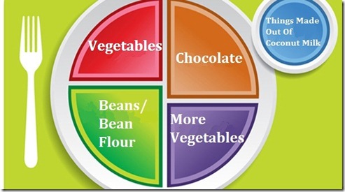
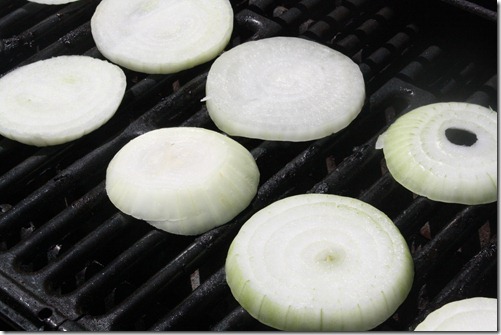
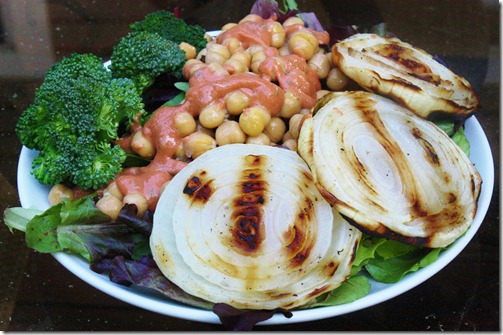
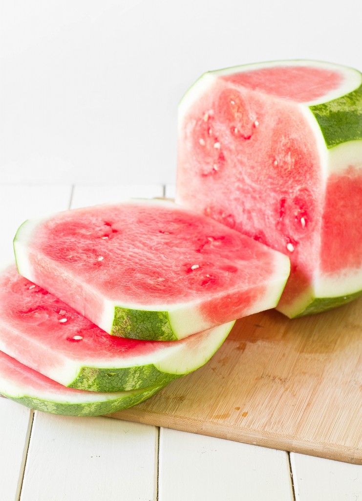
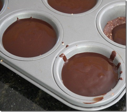
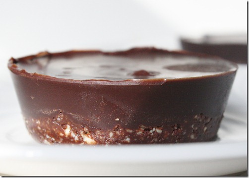
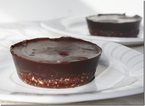
So, since one plate clearly doesn’t fit all, I made my own that’s more accurately suited for me:
At first I made this as a joke.
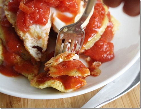
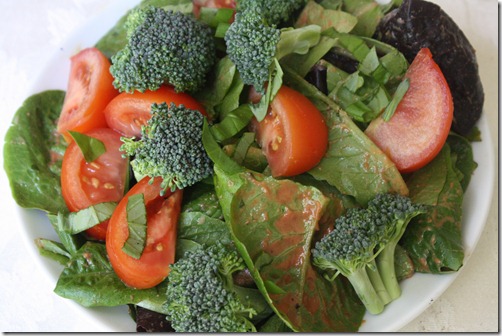
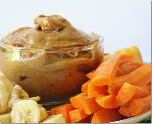
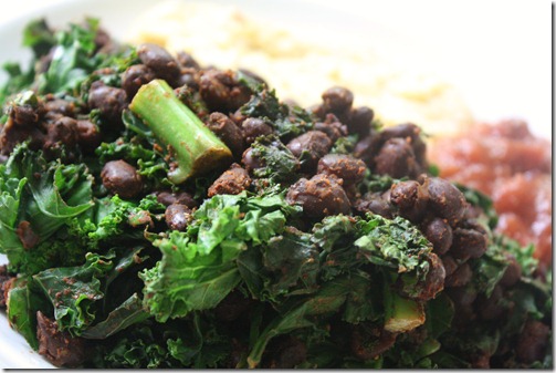
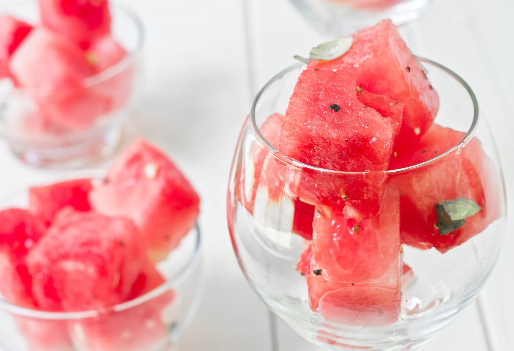
And then I realized I’m actually just a parody of myself for eating things like this,
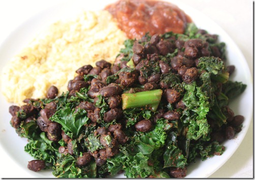
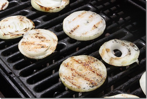
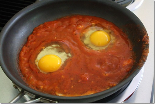
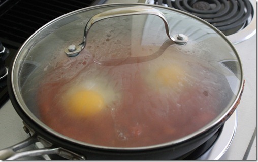
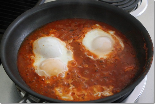
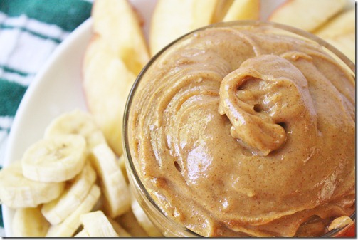
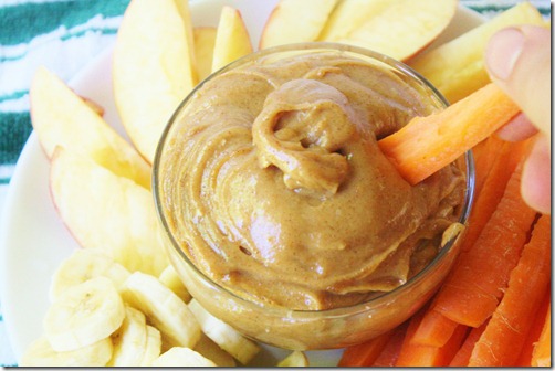
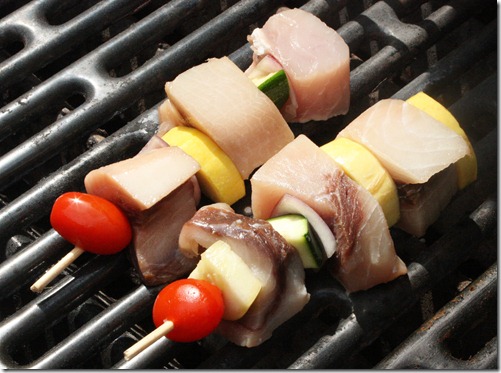
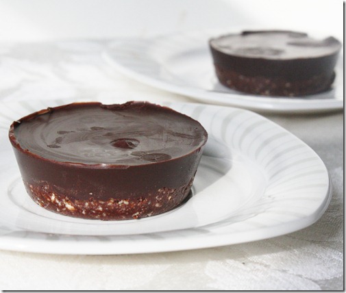
and this,
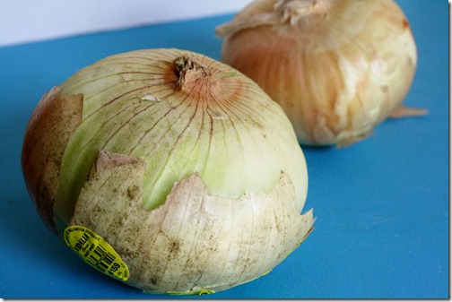
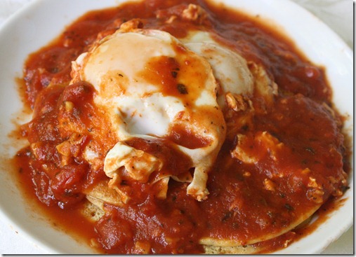
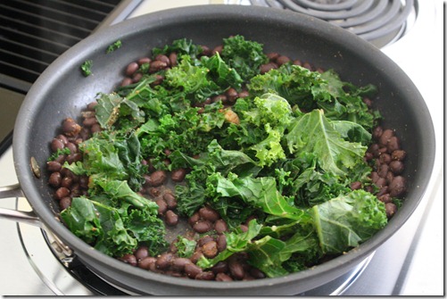
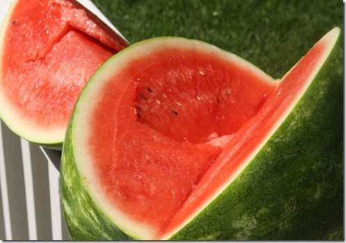
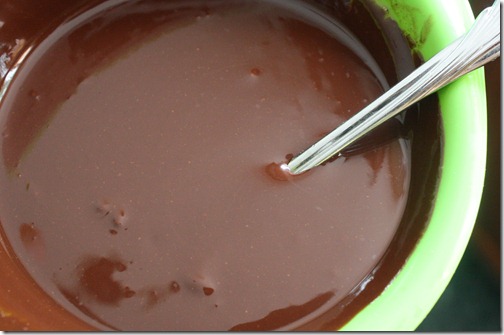
and definitely this
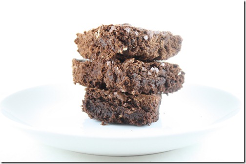
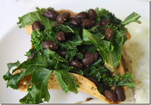
all. the. time.
But that’s OK, because those are my plates and they work for me.
What are your thoughts on the new plate system? What would your plate look like?


